What is White Space in UX Design
- March 24, 2025
- Posted by: Designient School
Did you ever encounter a website where text was too tightly packed and buttons were scattered all over the page? This experience shows you what occurs when designers ignore the importance of white space.
White space goes beyond being just “empty space” in people’s understanding of design. White space plays a crucial role because it enhances usability while making information easier to read and improves the overall experience for users. This blog post explains the concept of white space and demonstrates its importance and practical applications in UX design.
What is White Space in UX Design?
The area around design components including text and images which remains unfilled is called white space or negative space. The background color of white space can vary and does not need to be white.
Think of white space like breathing room. Reading a book that has no paragraph breaks or being in a room so packed with furniture that you cannot move around are both examples of how uncomfortable spacelessness feels. Does that sound comfortable? Not at all! The absence of clutter through white space establishes equilibrium in design which improves the readability and usability of content.
Types of White Space in Design
White space exists in different forms. Here are the main types:
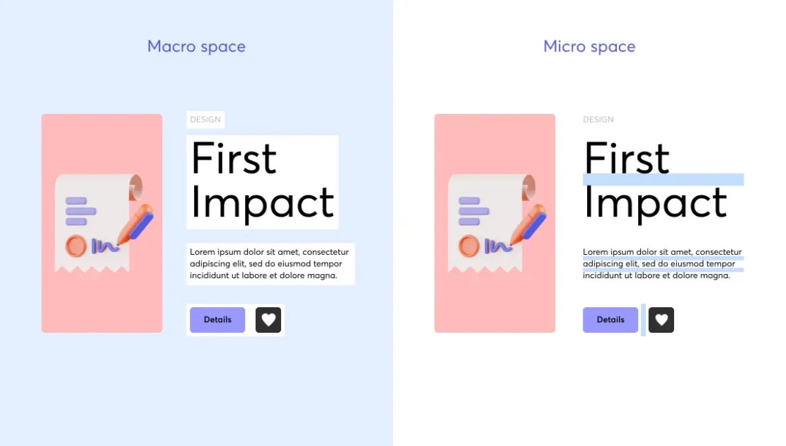
- Micro White Space: Micro white space refers to the tiny spaces between each character and word as well as line spacing within a paragraph. Micro white space ensures better readability while making text passages more comfortable for readers.
- Macro White Space: The larger gaps between sections, images and margins represent macro white space. White space guides users through content while enhancing the overall design framework.
- Active White Space: Usability benefits and organized display result from adding intentional space.
- Passive White Space: Passive White Space includes naturally existing spaces such as the gaps between lines of text or default margins.
What role does white space play in UX design?
White space goes beyond acting as empty space because it delivers substantial advantages for users and businesses. These points demonstrate why white space should be an integral part of UX design.
1. Improves Readability
Reading text that lacks adequate spacing between words and lines creates a taxing experience. White space makes text more readable while splitting large text blocks to enhance the overall reading experience.
Have you ever attempted to read through an article composed of extended paragraphs without breaks? Reading dense text quickly tires your eyes which causes you to lose interest. Proper spacing keeps readers engaged.
2. Enhances User Experience
Effective white space utilization in websites and apps creates a less cluttered appearance which helps minimize users’ cognitive load. The design enables users to go through information while understanding it effortlessly.
The Apple homepage serves as a prime example of a minimalist website. The design employs white space to establish a sophisticated appearance while guiding viewers towards essential components.
3. Draws Attention to Key Elements
The strategic application of white space serves as a spotlight to naturally direct users toward critical sections such as headlines and call-to-action elements. Strategic implementation of this element leads to higher conversion rates.
When designs become cluttered users struggle to maintain their focus. Through strategic spacing designers ensure that important elements like sign-up buttons and product features capture user attention.
4. Increases User Interaction
When designers utilize white space in their layouts they create an environment that motivates users to explore further. When users find a website too overwhelming they may exit immediately before exploring further. Clean design improves engagement and usability.
5. Creates a Sense of Luxury and Elegance
Many premium brands utilize extra white space within their designs. White space design helps luxury stores and premium brands of perfumes and tech products communicate an exclusive and sophisticated brand image.
Common Mistakes When Using White Space
The benefits of white space remain clear yet many designers find it difficult to implement effectively. This section outlines frequent errors involving white space and their solutions.
Using Too Little White Space: A design will appear cluttered and overwhelming if too much content is packed into a limited space.
Excessive White Space: Excessive white space results in an empty appearance that forces users to scroll through content they did not intend to.
Ignoring Visual Hierarchy: The deliberate application of white space helps distinguish sections while emphasizing important content.
Effective utilization of white space is crucial for enhancing user experience design.
1. Prioritize Content
Make sure your design’s most important elements are surrounded by adequate white space. The layout design directs user attention to the most important elements.
2. Optimize Line Spacing
Better readability results when you leave more space between lines and paragraphs. Readers find it simpler to scan and comprehend text when paragraphs include adequate spacing.
3. Use White Space Around CTA Buttons
Clutter surrounding your call-to-action (CTA) button will cause it to lose its visibility. The use of generous white space around buttons improves both their visibility and user interaction rates.
4. Group Related Items Together
The use of white space creates visual clusters which enables users to recognize relationships between design elements more easily. The space between input fields in an online form helps create a clear and logical sequence for users to follow.
5. Test and Optimize
Different audiences respond differently to spacing. Run A/B tests to determine which layout achieves the best user experience.
Final Thoughts
White space serves as an essential element for achieving seamless UX design beyond being just a design trend. The use of white space improves text readability while creating a better user experience and emphasizes important content on the page.
When you build websites or applications in the future remember that minimalistic design can be more effective. When white space is applied mindfully it can convert a busy layout into a refined and attractive design. Happy designing!